/portfolio
/portfolio
/portfolio
/portfolio

PEPITA
Nominated for a Vancouver UX Award in 2022
Pepita is a web-based tool that sifts through a database stocked with resources from reputable sources, which have been vetted by numerous healthcare professionals. Pepita works hard behind the scenes to ensure that our users feel they are receiving the information they deserve.
Chronic pain is a condition that affects 20% of Canadians. People living with chronic pain in rural and remote communities in British Columbia have inequitable access to valuable resources that help improve the condition of chronic pain an individual experiences. Inequities of access to those resources are due to barriers such as socio-economic status, distance to specialists in urban centers, lack of allied health professionals, limited diagnostic options, waitlists, non-attachment to primary care, and cultural safety concerns. Consequently, individuals living with chronic pain in rural or remote communities are severely impacted by their condition, experiencing a detrimental impact on physical well-being, mental health, and social life.
Our team set out to create a tool, service, or process that promotes health equity for persons living with chronic pain in rural and remote communities in BC, resulting in pain abatement, less reliance on opioid medication, reduction in pain-related overdoses, decreased health care costs, improved patient health outcomes, and enhanced quality of life. Barriers to care sometimes include a need for greater trust in the healthcare system. They may also be due to limited internet access or proximity to technology in general. In this context, how might a tool or intervention help to connect individuals to better care as well as create more trust, reduce the stigma associated with chronic pain, and ensure cultural safety—particularly for indigenous communities and families?
Given this information, we have raised the following question:
"How might we promote health equity for people living with chronic pain in rural and remote areas of British Columbia?
My Role
UX Research Lead
As the UX Research Lead for Pepita, my role was to oversee the evaluation and improvement of all touchpoints in the product. This involved managing and conducting user research and concept development, collaborating with cross-functional teams, and recruiting participants for user research studies.
Throughout the project, I was responsible for ensuring that the product was user-friendly and successful in meeting the needs of its target audience. This involved evaluating the usability of the product and conducting research to identify areas for improvement.
In collaboration with the design team, I worked on wireframes and mockups to improve the information architecture of the product and conducted usability testing to evaluate the functionality of the MVP. I also helped to develop the onboarding flow and resource layout to ensure that users could successfully complete the onboarding process and find the resources they needed.
My duties and responsibilities included:
-
Managing and conducting user research and concept development
-
Working closely with marketing and product management teams to identify research topics
-
Collaborating with design, product management, content strategy, engineering, and marketing teams
-
Participating in recruitment activities for user research
-
Planning and implementing the overall user research strategy and methods
Team
Isabela Lopez
Emma Bousfield
Michelle Gu
Priyanka Dhapare
Simran Singh
Thelma Weigert
Duration
Eight Months
Tools
Figma
Miro
Notion
Methodology
Agile
Scrum
Strategy
Our team needed to become more familiar with chronic pain and its complexities, so we spent the first weeks thoroughly researching the topic. We realized that we needed to gain as close to expert-level understanding as possible with a subject of such importance. Our findings were eye-opening and demonstrated the gravity of the situation. Furthermore, our research allowed us to build greater empathy with our users, which was tremendously important.
Based on the parameters established by our secondary research, we identified that chronic pain typically emerges and becomes more prominent in individuals around 45. As a result, our target demographic largely falls within the 45-60-year age range, which provides us with the most significant sample of people to engage with. We recognize that pain is a sensitive subject, and we are committed to approaching our next steps with the utmost appropriateness and respect. To aid us in our journey toward designing a solution that improves people's lives, we relied on the following, research methods
User Interviews
We compiled a list of candidates who were willing to speak with us through our contact at Providence Health. We conducted 12 semi-structured interviews, each lasting an hour, with a diverse group of individuals, including patients, professionals, and individuals working with NGOs to address the problem at hand. The interviews were conducted in three parts: warm-up, about the problem, and cool down. During the Warm-up section, we took the time to get to know the interviewees and their backgrounds, what motivates them, and what has led them to where they are today. In the About the Problem section, we focused on addressing the issue at hand, allowing us to hear people's opinions and perspectives on the matter. Lastly, Cool-down section, we aimed to create space for further conversations beyond the topic at hand—in case the interviewees had any additional questions or information they wanted to share.
By tailoring the interviews to each participant and their unique experiences, we gained a comprehensive understanding of their journey through pain. Through these user interviews, we were able to define the scope of our problem and fill in the gaps in our secondary research. After conducting 2-4 interviews, patterns began to emerge, and we could see the problem take shape. Direct participant feedback allowed us to identify pain points and opportunities to make a positive impact.
Overall, the interviews played an integral role in shaping our solution. By actively listening to varied perspectives, we were able to gain a broader understanding of the problem and design a more effective solution. The following quote best sums up the impact of these interviews:
“Every person feels pain differently”
“There are a lot of resources, I just don’t know where to find them”
“Don’t reinvent the wheel, there are resources that exist, they just been to be converted into plain language and easily distributed ”
Customer Journey Mapping
We gained a unique perspective on this project by analyzing each interview individually. This process revealed common concerns, frustrations, and pain points among the participants, and helped us better understand their differing opinions. By combining this information, we identified potential solutions to the issues at hand.
These pieces of information were instrumental in driving progress. We recognized the need for a solution that would not introduce any new elements but would make it simpler to discover existing content regarding Chronic pain mitigation. It needed to be lightweight and easy to comprehend. Above all, it was crucial to develop something that would offer a curated and personalized experience for each user as they input details of their pain or needs. Our users asked us not to "reinvent the wheel," but to recycle it instead.
Competitor Analysis
Once our solution began to take shape, we realized the importance of conducting research. By carefully examining similar products, we were able to identify several common practices. These insights enabled us to pinpoint four key takeaways that we aimed to incorporate into our own product:
-
Content diversity and support for various forms of content, such as videos, articles, tutorials, etc.
-
Customizable experience: Users should have control over their own experience, moving away from a "one-size-fits-all" approach.
-
Consistent UI: Many products lacked consistency, resulting in challenging navigation, inconsistent experiences, and difficulty understanding the product.
-
Free: Most relevant apps require memberships, which makes them inaccessible to users. This adds another layer of complexity to their journey in seeking pain relief.
These findings provided us with guidelines to consider during the design process.
Usability Testing
We performed three rounds of usability testing with each round specifically targeting a distinct area of the product. This approach narrowed our focus, concentrating our efforts on a specific aspect of the experience.
Round 1: Onboarding + Questionnaire
In the first round, we aimed to evaluate the user's ability to complete the onboarding process successfully and identify any issues they encountered during the process.
After analyzing the data, we determined that our onboarding process should be brief, consisting of 8-10 questions. Additionally, we were mindful of the length and wording of the questions we asked. Some users felt that the questions were "too wordy," not only in terms of word count but in how they were phrased. We recognized the need to use language that was both accessible to our target demographic and detailed enough to communicate the information we required.
Round 2: Questionnaire and Product Language Evaluation
Accessibility is an important factor to consider. Designing a tool for a demographic with an average reading level of a high school student meant we relied heavily on online tools to help us achieve the desired level. We tested our product and questionnaire’s language by analyzing readability, length, and tone. Once this was achieved, we tested with participants and asked a range of follow-up questions to see if they could recall certain data the product presented them with. We wanted to ensure they were able to understand each piece of information they were shown.
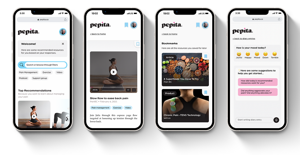
Round 3: Resource Layout
Lastly, we wanted to evaluate the organization of the resources provided to users after onboarding. We utilized a combination of A/B testing and semi-structured interviews.
Here are some significant results we uncovered:
-
users wanted to know why they were provided with a specific resource
-
users reacted well to their provided resources
-
users indicated they wanted to “feel embraced” by the product once they arrived at the resource page
-
users wanted to see what categories they were given and be given the ability to alter their categories
After reviewing these findings, we decided to focus on improving the way we present data. While the initial resource page was effective, we recognized a need to enhance the layout of the interior pages. We implemented a more legible font and relocated buttons to a less distracting position. To better provide a more robust understanding of resources for users, we briefly explained each resource's relevance in each section. Moreover, we added filters to make it easier for users to rapidly find their preferred categories and make changes as needed.
Our approach to a user-centred design heavily relies on the voices of our users. When dealing with a problem space like chronic pain, we knew we had to rely on our expertise in facilitating workshops, interviews, surveys, and usability tests to ensure our solution met the user's needs. Our user group was unique in that they knew what they needed, but required someone to listen and design a solution that catered to their journeys.


Innovation
Our design solution was born from a very simple concept: an accessible one-stop shop for users to gather tailored resources that already exist. As simple as that sounds, this had layers of complexity that took months to define, test, and iterate. Our solution took valuable and vetted chronic pain resources and cataloged them, creating a more accessible, user-friendly, and user-tailored solution to finding these resources online. A chronic pain resource curation product surprisingly didn’t exist.
According to our findings, COVID-19 forced nearly everyone to become more accustomed to cell phones and the use of social media. Through these channels, they were granted access to an overwhelming amount of resources such as YouTube videos, articles, tutorials, and web applications. The number of resources was so large that instead of driving users to explore their options, they felt belittled and uncertain about what to choose. Sifting through our research findings, we noticed a significant number of respondents said they didn't know how to start looking for resources that worked for them. We identified this gap as an opportunity.
How might we help people access resources catered to their specific pain?
We studied examples from platforms like Spotify, Felix, and Medium and recognized a trend of creating personalized experiences for diverse audiences. These platforms often use questionnaires during onboarding, which could be predetermined categories or direct user input on preferences. The goal is to gather enough information to personalize the experience. While we found many examples, we couldn't find one that suited our needs. We borrowed ideas from our research and innovated on them to create a unique onboarding and in-app experience for Pepita.
Onboarding: Questionnaire
We developed a questionnaire to categorize the type of resources each person requires based on their specific pain - physical, mental, or physiological. Each question is linked directly to a specific type of pain, which activates resources directly tied to the selected pain, allowing us to provide a list of resources that reflects the users' inputs. The questionnaire acts like a search engine that sifts through a list of vetted resources and brings the proper listings forward. We also considered the type of resources individuals prefer. Some are visual learners, so a video would be ideal, while others prefer reading. This questionnaire eliminates the hassle of searching through 18 links to find one that may be suitable for you. You can think of it as a smart engine or, in today's world, a chronic pain-focused ChatGPT.


Elegance, Clarity &
Emotion
We aimed to create a brand for Pepita that was attractive, mature, and approachable, and our branding successfully achieved this goal. Pepita is a variety of pumpkin seed that is rich in magnesium, which is known to alleviate migraines and may help prevent and treat osteoporosis. The name "Pepita" has a distinct sound and feel that we strive to convey throughout our user experience. The visual design of Pepita was carefully crafted using colour psychology. We chose blue to represent productivity and creativity, while soft pink was used to promote calmness.
One of our main priorities making sure Pepita's intentions were clearly communicated. To achieve this, we used language that was appropriate for our audience, ensuring that Pepita's intentions were never misinterpreted. Throughout the product, we aimed to use a tone that was clear, concise, and welcoming. Users suggested that simpler language would be easier to understand and, therefore less intimidating and more approachable, especially since they are already dealing with chronic pain and should not have to decipher complex terminology.
Using appropriate language allows us to adjust Pepita's tone. After a user completes onboarding, they will be greeted by name. Friendly comments are scattered throughout the experience to create a sense of belonging in the app. Users have expressed that they want the experience to feel "like a warm hug," so Pepita should be as friendly as someone whom you would embrace. Pepita strives to be a cheerleader and a source of support when things get difficult. Additionally, Pepita learns and adapts to user behaviour and preferences, keeping this web app fresh and engaging.
We incorporated emotional design principles into our product by creating Pepita as a companion for the user throughout their experience. We gave Pepita a personality through the use of colour and a friendly tone of voice. Additionally, we made her dynamic by allowing her to showcase various resources, such as videos and books. In turn, Pepita empowers the user by enabling them to personalize their settings and preferences. She encourages users to take control of their journey, while always providing support and guidance.
Impact
Once our high-fidelity prototype was developed, we reached out to several initial participants to gauge their satisfaction with Pepita’s outcome. We were pleased to receive positive feedback, with some participants offering the following comments:
"I feel taken care of, and I also feel like I have control over my health"
"I feel heard, I feel informed, I feel happy"
"Pepita took a difficult journey and turned it into an enjoyable experience"
It is clear that Pepita has accomplished the outset objective of providing users with easy access to curated pain resources. Furthermore, user feedback indicates that they appreciated the level of control they were given over their experience using the platform and found it enjoyable overall. With our client Providence Health now steering the future of the product our team developed, it’s being put forth as a mainline service and application to be used by thousands of chronic pain patients.
Pepita’s extensive commitment to providing an exceptional user experience has not gone unnoticed. At the Providence Research Impact Awards in 2022, Pepita was recognized for its outstanding contribution to pain management research and awarded the Research Impact Award. This recognition validates our belief that providing a user-centric experience is vital in creating a product that truly makes a difference in the lives of those who suffer from chronic pain.
We believe that by staying focused on our users' needs and continuing to prioritize user experience, we can continue to deliver a product that exceeds expectations and drives value for our users.